


Just days after Amazon took the wraps off the biggest overhaul to its Prime Video service in two years in a bid to fix one of its subscribers' most common complaints about the streamer, Netflix has also started to experiment with a bold new appearance for its apps.
So far, Netflix has only shared its latest redesign with a small group of users — with the new look tipped to be released to all 269.6 million subscribers worldwide later in the year.
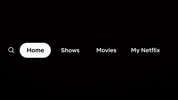
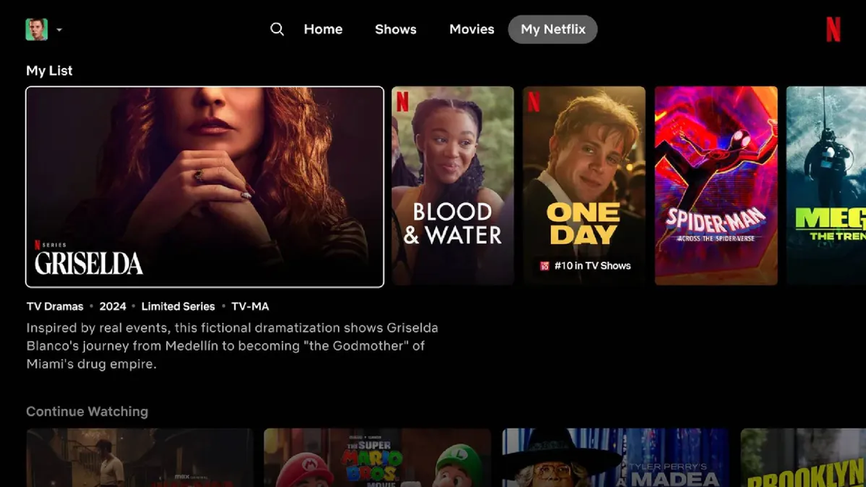
With its experimental new design, Netflix has shifted the main menu options to a bar that runs along the top of the app... and ditched the My List tab. Expansive new previews show-up in a carousel at the top of the app now too, with videos and synopsis loading the moment a title is selected
|NETFLIX PRESS OFFICE
The carousel of static artwork for films, documentaries, and TV shows at the top of the Netflix app will be swapped in favour of dynamic boxes that expand when selected to reveal a brief synopsis, genre, run-time or the total number of seasons, and age rating. A quick teaser video will also automatically start playing.
When the new appearance was first announced, Netflix Senior Director of Product, Patrick Flemming said the changes were designed to help users cut down on the "gymnastics they do with their eyes".
However, not everyone who pays for a Netflix subscription is convinced by the changes.
Dozens of people flocked to social news website Reddit, flooding the discussion forum dedicated to Netflix with negative comments about the redesign.
One disgruntled Netflix subscriber posted: "I hate it. The titles takes up the whole screen. Before you could see like 10 movies at once but now only 2-3 because it's so oversized. This is ridiculous. Who would like this?? I have no idea how this was given the green light."
Comment
byu/Traveler60k from discussion
innetflix
"I just got the new UI today on my Sony," another added. "THE MOST GODAWFUL ABOMINATION BASTARDIZATION OF A UI I have ever had to deal with.
"Brutal, brutal, brutal. Now on the screen we have almost nothing in view, and we have to endless slide using tv remotes left and right buttons which is very cumbersome. The fantastic grid where you could see what was in My List in one easy view. Gone!
"I can go on and on. It is beyond stupid. The management team that dreamed this up should be shown the door. I do not even want to turn on my netflix anymore. It is a chore just to do anything in the interface and everything is so difficult to get to. Navigation is beyond clumsy."
Comment
byu/Traveler60k from discussion
innetflix
Enraged Netflix users have suggested they'll stop paying for a subscription, which starts from £4.99 per month for an ad-supported plan in the UK, due to the new appearance. One example reads: "My roku netflix home screen has changed again. Where is the continue to watch section?
"Every square is in your face, and it is way too much. Why would you make things more difficult? This is very hard on the eyes. Sometimes, why am I paying for this crap?"
The larger previews that now greet you when you launch Netflix aren't the only change in the new design. Netflix designers have decided to ditch the menu that usually pops up from the left side of the streamer with shortcuts to Search, Home, Shows, Movies, Categories, New & Popular, and My List.
These have been shifted to the top of the refreshed app... but you won't have to scroll back to the very top of Netflix to access these shortcuts, something that would take a long time. Netflix says you can press the back button on the remote of any Fire TV Stick, Roku player, Apple TV, or Smart TV to jump to these options.
Some of the options previously available in the Netflix app have been ditched as part of the relocation to the top of the interface. Gone are Categories, New & Popular, and My List ...something that comes up time and time again in the list of complaints from frustrated Netflix subscribers.
In particular, the decision to drop My List seems to have struck a chord. This To Do list allowed subscribers to put together a shortlist of films, documentaries, or TV shows when browsing to revisit later on. The list was synchronised across all of your devices — helping you to avoid becoming overwhelmed by the entire catalogue.
My Netflix combines this functionality with suggestions from the streaming service's recommendation algorithms and titles you've recently watched that you might want to revisit. With the new design, it's still possible to access Categories, but this has been bundled into the Search tab.
LATEST DEVELOPMENTS
- Beginning of the end for Google? ChatGPT launches all-new rival
- REVEALED — Worst UK broadband named and shamed
- Missing the next Samsung Galaxy update could have dire consequences
- Devastating blow for BT as record number cancel broadband
"With so many titles — plus now games and live — it’s imperative that members can easily find the right title or game at the right moment," Netflix explained the changes in a letter for its shareholders, published at the most recent quarterly earnings call. "While our recommendations are widely recognized as industry-leading, we believe we can do much more to improve discovery on Netflix."
Netflix has been emphasising engagement time as a key metric for some time now, telling its investors that the amount of time spent on its streamer is the "best proxy for customer satisfaction". The Californian company, which recently drove up subscription numbers with a tough crackdown on password sharing, will stop regularly disclosing its total number of subscribers from 2025.
How to revert back from new Netflix design
If your set-top box has been updated with the experimental new Netflix device, or you want to be pre-emptive and block the beta test before it comes to your household, follow these simple steps:
- First up, head to netflix.com/DoNotTest and sign-in
- Then launch the app on whatever platform you use
- Head to the App Settings menu and clear the cache, if it's available as an option on your device
- Alternatively, you might need to remove App Data elsewhere (i.e. Fire TV's Manage Installed Applications menu)
- If none of these are possible, then simple delete the Netflix and reinstall from the app store
- Log out of Netflix, then log back in